You typed a prompt. Your AI generated something beautiful. You showed friends, they said “wow.” You were ready to launch.
Then you tried to put it on a business card.
It pixelated.
You tried to make a favicon.
It became unreadable.
Your printer asked for vector files.
You didn’t have any.
AI generates images. Logos are not images.
A logo is a system, not a picture. Your Midjourney output is one PNG, at one resolution, locked forever as it was generated. That isn’t a logo. That’s a screenshot of an idea.
Real logos exist in:
- Vector format (SVG, AI, EPS) — so they scale to billboards or shrink to favicons without falling apart
- Multiple variants — primary, secondary, horizontal, stacked, monochrome, knockout
- Defined color systems — exact CMYK for print, RGB for screen, HEX for web, Pantone for merch
- Typography pairs — real fonts, properly licensed, that match the wordmark
- Usage rules — minimum sizes, clear space, what backgrounds work, what to never do
Your Midjourney logo has none of these. It can’t.
The text isn’t real text.
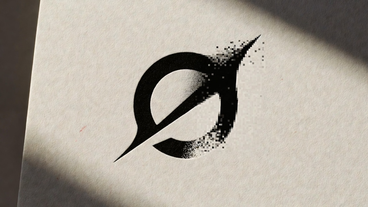
Look closely at the letters in your AI logo. Are they actually letters? Or are they hallucinated shapes that look like letters from a distance?
AI image generators don’t understand type. They generate pixels that resemble typography. Zoom in and you’ll find broken serifs, malformed counters, characters that aren’t quite characters.
You can’t fix this in AI. You can’t change “Joji” to “Joji Co” without regenerating the entire image — and getting something different.
You can’t protect it.
AI-generated logos exist in a legal grey zone. Most jurisdictions won’t grant copyright on work without human authorship. You probably can’t trademark something another prompt could regenerate tomorrow.
This matters more than founders think. Your logo is your most important brand asset. If a competitor shows up with something nearly identical, you have no recourse.
It has no strategy behind it.
A real logo answers questions:
- Why this shape?
- Why these colors?
- What does it say about who we are?
- What does it say about who our customers are?
- How does it differentiate from competitors?
AI doesn’t know your strategy. It pattern-matches against thousands of other logos in its training data. That’s why AI logos all start to look the same — clean sans-serif wordmark, minimalist geometric mark, vaguely tech-startup aesthetic.
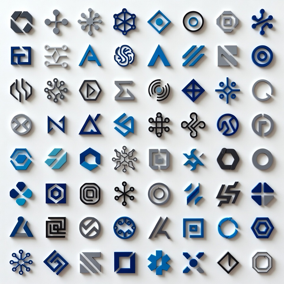
They reflect the average of what’s already out there. Your brand should look like you. Not like the average of everyone else.
What “making it real” looks like.
When someone brings us an AI logo, we don’t throw it away. We treat it as a concept — a direction, a feeling, a starting point.
Then we:
- Redraw it as a true vector
- Fix the typography (or rebuild it with real fonts)
- Build the system around it (variants, colors, rules)
- Test it at every size from favicon to billboard
- Document it so anyone on your team can use it correctly
- Make sure it’s something you can actually own
The result looks like what you imagined.
Except it works.
Got an AI-generated logo? Show us. We’ll tell you what it takes to make it real.