A summary of a discussion on UX Scorecard.
March 28th, 2018 | Design

First posted on UXSG (http://www.uxsg.org/2016/07/20/ux-scorecard-even-possible/) in July 2016; a summary written by me, after attending a UXSG meetup session, where I hosted a breakout session on the topic of the possibility of an UX scorecard.
HOW DO YOU SCORE UX
One may ask. It appears like a simple question, but it provokes profound thoughts on how is it even possible to score a discipline as wide and extensive as User Experience Design.
But imagine the clarity and possibility it could bring, if one possesses a scorecard that can help UX designers and teams around the world determine whether their solution is a good one or whether it is one that in need of further iterations – what a difference it could make to our line of work.
So lets dig deeper.
METRICS
To rate anything, we will need to first decide, what is the metric that we would want to measure UX with. And right as the beginning of the breakout group discussion, this is what we try to tackle head on.
Some say “Happiness”, as it is often associated to the end result of product & services crafted by UX design. Others say, it could be the other side of the coin – the level of “Frustration” it may cause?
“Does it solve the customer problem” one said. “Simplicity” said another. But definitely, “Simplicity” alone cannot be it, thus another participant suggested “Elegance” – “as simple as it can be; complicated as it needs to be”. But, is a simple and lean solution = great user experience?
So in an attempt to break it down, we try to set what are the criterias / metrics that we may want to have on the scorecard:
- Goal
- Achievement
- Accessibility
- Ease of Use
- Usable for Everyone
- Emotions
- Natural (intuitive)
- Forgiveness
INTRINSIC VALUE
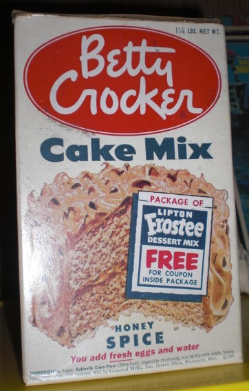
The story of Betty Crocker came up.
In the 1950s, Betty Crocker launched a cake mix that allows customers to bake a cake in one step (think: instant noodle). However, the product was unable to take off. After researching the problem, they discovered that the housewives “the lack of effort” in the baking process, denied them the satisfaction of baking a cake. As a result, they removed the egg powder from the mix, so that the customer can add fresh eggs into the mix before baking : a 2 step mix. Since the change into a 2 step mix, the sales of the cake mix took off.
You can read more about it here: http://www.90percentofeverything.com/2009/10/20/just-add-an-egg-usability-user-experience-and-dramaturgy/
DEEPER MEANING
So the Betty Crocker story, begs the question – could creating a scorecard for UX be about the search for a deeper meaning; a deeper connection with the user at a level beyond the obvious – perhaps emotional, psychological or spiritual. I find this concept really intriguing.
Could it be that a good UX will solicit a honest emotional or psychological feedback from the user? Could that be doorway to the first step to scoring UX?
EXISTING MODELS/THEORIES
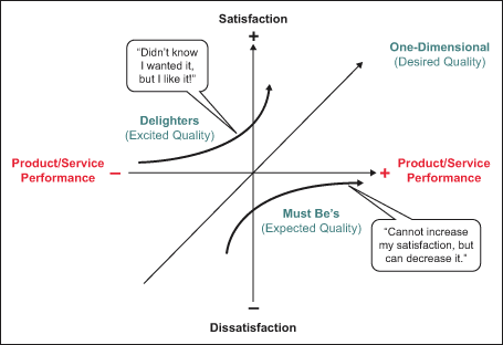
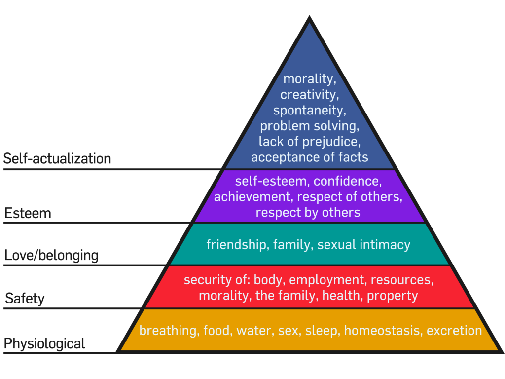
The conversation is then drawn into existing models/theories that are used in business/product analysis – that perhaps Kano Model or the Maslow’s Hierarchy of Needs could be a good basis point to construct a scorecard for UX.

In the Kano Model, to put it simply, features in a product/service can be split into 3 types:
- Expected Quality (Usability/Hygiene) – in which the features are expected by the users, and its usually the functional part of the product/service
- Excited Quality (Delight) – features that excites and stimulates the users emotionally/psychologically
- Desired Quality (Performance) – the few features that increases the users’ satisfaction in relations to the features’ quality (for example, acceleration in sports car)

The Kano Model inspired the consideration of Maslow’s Hierarchy of Needs’ theory where basic needs must be addressed first, before one would start considering improved performance or “delight / luxury”.
INCONCLUSIVE
The discussion ended at this point (Maslow’s) as we ran out of time.
So YES, we did not have a scorecard ultimately – not even remotely in my opinion. But we have taken that important first step into considering how do we score UX and how would such a scorecard may look like if we would ever develop one.
The mysticism of what is Good UX and what is Better UX will endure a little more… but I have a strong conviction that the day a practical usable scorecard for UX will eventually come.
I fully agree with Chris Do
December 16th, 2017 | Design

I think Chris Do put it really well why the new F1 logo is awesome, and more… So I not gonna write another long article just to explain why it is, check the great video by the design master, Chris Do:

